Quirky products are showing up in greater number – or we should rather say, the quirky packaging of normal products.
The presentation of this oat yogurt by Oatly is an example of marketing for the peculiarly metamodern consumer in a couple of ways:
- Overall, the sides of the package grab attention by talking to you, the consumer, in manner that seems to convey, “You can relax. It’s me– your buddy!”
- With unabashed self-reflexivity, there’s an assumption that the fourth wall is already broken.
You probably cannot read the text in these photos, so we will walk you through…
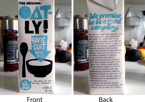
The front side reads, “No milk. No soy. No…eh…whatever.” Purposefully not hi-falutin’, both graphically and textually. Just the basics.
The back side asserts the company’s earnest aims of goodness and integrity, in a way that clearly attempts to appeal to the metamodern desire to cut through the b.s. They admit upfront, rather proudly even, to being flawed:
We are not a perfect company, not even close, but our intentions are true. We would like to be judged by the good we do, not just the pretty words we say.
The “narrator” assumes that we agree this is a breath of awesomely real fresh air, in an otherwise crass and manipulative corporate world.
After a few more über-sincere paragraphs, including their aim “to make the food industry a more honest place by declaring to be transparent in everything we do,” they make sure to balance the scale with an assurance that being fun and light-hearted is an equally important guiding principle of the company: “We are not usually this serious on our packages and promise not to make it a habit.”

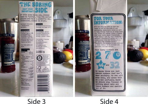
Side 3, self-consciously called “THE BORING (but very important) SIDE” begins with a warning that the nutrition information is in fact possibly going to kill your buzz. So you are directed to exercise your right to not care about it: “If this side bores you, please read no further. Flip the carton around and have a wonderful day.”
Side 4 – Here, avoiding being boring or full-of-oneself is again emphasized; to that end, the package goes overboard to present some throw-away entertainment, again in a fully self-conscious manner, with a (postmodern) tone of self-deprecation, that makes fun of (modernist) divination:
It’s not easy to come up with new ideas to put on the side of our packaging, especially since we want to keep things fresh so we never bore you. After all nobody likes a friend that only talks about themselves. “Yeah Oatly, I get it. Your products deliver a balance of carbs, protein, unsaturated fats and fibers. Yeah, you said that already (yawn).” Therefore, the single-minded purpose of this package is to provide you with some useless advice. Your lucky numbers are 2,7,8,46, and 32. Or maybe those are just random numbers that don’t mean anything. No one will ever know, and since this is a bit confusing maybe we should stay focused on writing about oats and leave the numbers and destiny out of it.
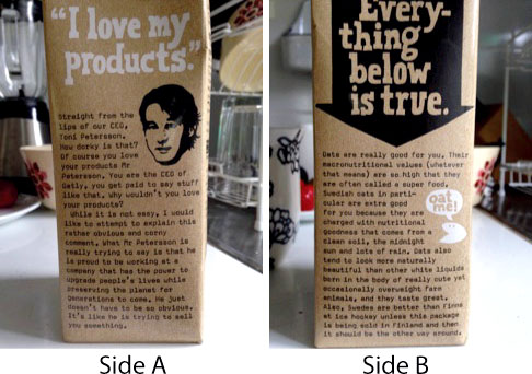
And now, here are two sides of yet another Oatly product—their oat milk…

A small, simple graphic of the CEO’s head proclaims “I love my products.” And beneath that, our narrator remarks, again with utmost self-consciousness:
Straight from the lips of our CEO, Toni Petersson. How dorky is that? Of course you love your products Mr Petersson. You are the CEO of Oatly, you get paid to say stuff like that. Why wouldn’t you love your products? While it is not easy, I would like to attempt to explain this rather obvious and corny comment. What Mr Petersson is really trying to say is that he is proud to be working at a company that has the power to upgrade people’s lives while preserving the planet for generations to come. He just doesn’t have to be so obvious. It’s like he is trying to sell you something.
The media-savvy self-aware tone of this packaging is not entirely metamodern – it seems rather to reek of its antecedent episteme, postmodernism. How about this: it’s the combination of the winking postmodern “we-know-that-you-know” approach to consumer communication (as pioneered by 7Up in the early 90s) with a more earnest, golly-gee, “let’s-be-friends” message that makes it clear that the folks who designed this company’s brand seek to appeal to a metamodernist sensibility.
*****
If you enjoyed reading this article, check out our recent post on some truly unexpected, remarkably metamodern marketing:


